Out this week
Tuesday December 18th 2012, 3:36 amThis week sees the release of Batwoman 15, sort of a sidetrack interlude issue into the main story focused on Detective Maggie Sawyer. And below is the cover process for this issue.
This cover has gone through an interesting evolution and will ship with quite a bit of a different cover than what was solicited. And this particular cover didn’t go through the regular editorial approval sketch process due to running out of time to get something done in time for solicit catalogue printing. So I described the basics of the cover concept and it was approved from that. It was then completed and everyone was happy, but then at the 11th hour it was decided it was all wrong. I’ll explain as we move along through the images…
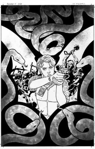
Here is the original black and white version…

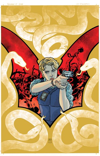
This is the original color version…

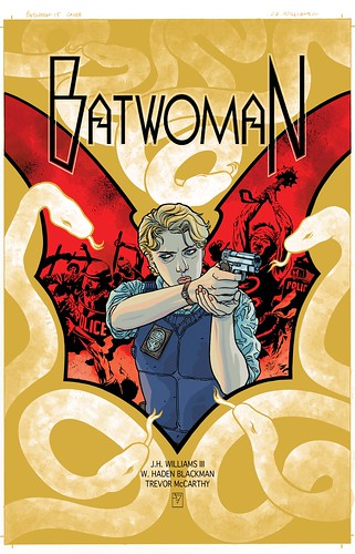
This is first version of the logo placement…

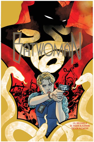
Now what comes next is the result of that 11th hour problem of the cover being wrong. The goal of this cover design was to showcase Maggie Sawyer since the issue really is about her. The concept that you saw above was the approved version of that idea, and we all thought Batwoman was adequately represented by use of the giant red bat that the action and Maggie sit within. But at the last minute it was decided by upper editorial management that featuring a cover without Batwoman herself present was the wrong thing to do. This posed a conundrum as I really had no time in my schedule to create an entirely new cover. So I asked for their trust in making dramatic alterations to the existing image by figuring out a way to sort of insert more of a physical Batwoman presence while still keeping the design purposeful. This could really only be done with digital manipulation. So I took the below patch image, which was hand drawn then scanned and colored to use as the add in element…

This new image piece was then inserted into the cover, but things on the original image needed to be shifted around to accommodate the new element fitting properly. This is the result of that. And finally because so much had to be moved and shifted and ghosted, I thought it best to shift the colors slightly and then significantly alter the logo and text placement for a final design. Even though it was all sort of by the seat of our pants this time, I like the end result of the piece…

14 Comments so far
Leave a comment
Holy eleventh hour bologna slinging, Batman! O__o
The good news, J3, is it looks great and I’m glad Maggie still gets the center seat. All in all, I admire your adaptation to editorial opinions. I probably would’ve popped a gasket half a mile back.
Hey there Ash
Thanks. And trust me, I pop gaskets very often, just don’t publicly vocalize them too often.
Wow, that is indeed an interesting story regarding the final changes to that cover (which I love to death). What a fantastic example of an artist making the better of a sticky situation… Very impressive! Besides, it doesn’t look like a last minute tweak at all — rather, it adds a fascinating new layer of symbolism to the whole design.
An impressive cover for (yet another) impressive issue!
Cover looks great. Although I was bummed to see you weren’t on full interiors (although TM is awesome), having a full Maggie issue is more than worth it. There isn’t a book I read that has such an amazingly well developed ensemble cast. Keep it going!
Comment by Mikey 12.19.12 @ 9:00 pmHello Mathilde
So happy you dig the blog post and the new issue. I think its fun for people to see this sort of stuff, when something has to get altered.
Hey Mikey
Yeah, getting Trevor for this sequence was a purposeful thing, really to set the interlude apart from everything else around it for a more unique narrative experience as an entire arc.
I like the end result. Necessity may be the mother of invention, but I’m aware that the “children” don’t always turn out the way one hopes; on this occasion I think that you emerged with not just a commercially stronger but perhaps symbolically stronger piece by having Batwoman’s spectre incorporated into the design.
Comment by Blam 12.25.12 @ 9:19 pmJust a quick note to follow-up -> I loved the “maggie” issue. I thought it was great and it made me really, really wish Trevor McCarthy worked in pen/ink so I could get a page of his! Well done!
Comment by Pam 01.03.13 @ 11:44 amFinally got a chance to read this issue today. Nice spotlight on Maggie and the families of the kids who were abducted. After the last couple of issues I think this was needed to remind us of what was at stake, both for Kate and Maggie and the families affected.
Comment by CraigM 01.07.13 @ 11:21 pmHey there Pam
thank you so very much. You should bug Trevor, get him to start working on the boards…
Hey CriagM
Thank you, glad you could see what we were aiming for with this.
Leave a Comment
** Required but not displayed
I love it !! Cannot wait to get my copy!
Comment by Pam 12.18.12 @ 8:31 am