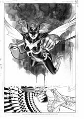
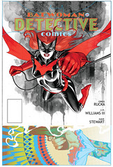
Detective comics cover 1 (in stages)…
Friday March 27th 2009, 7:52 pm13 Comments so far
Leave a comment
Just beautiful!
I love how the colours of the title compliment those in the lower image.
I like how it looks like two panels too like Brian says.
Is the lower image for the Question story then?
Comment by Dan 03.29.09 @ 3:37 amHey there Dan
Thanks for noticing the color balance. It was a bit tricky to make those choices work just right.
That bottom actually has nothing to do with the backup feature. This cover was designed a long time ago, at the beginning of 2008. It was the very first image I did of Batwoman actually. At that time we had no plans for backup features or even plans to be in Detective Comics. Those are all very recent developments.
Comment by jwh3 03.29.09 @ 10:54 amMy goodness is that ever pretty.
Those colors work off each other no nicely, a lot of people wouldn’t even try them but you nailed it!
Still can’t wait to get my hands on this.
Comment by Aria 03.29.09 @ 11:34 amLord, that looks gorgeous. Is that the final trade dress? The red and green makes it look sort of… Christmas-y.
Comment by David Uzumeri 03.30.09 @ 7:58 amHey there David Uzumeri
Glad you like it. As for the trade dress… Yes that is most likely the final trade dress. It’s a bit funny that it made you think Christmas-y. I hadn’t looked at that way at all, until now. The main goal was to balance the colors with the colors of the image at the bottom. I had originally had a blue tone where that yellow/green is but it sort of deadened the whole thing. The other option was to just ignore the bottom color palette but then it would be too top heavy. So it needed to stay balanced. I went through probably 5 variations before settling on what you see.
Ack! I hope that didn’t come across as negative criticism, since it *does* wonderfully balance the color choices at the bottom (moving the UPC code up is also a really nice touch). The Christmas thing really only hit me while I was scrolling down and only looking at the top part. Either way, excited as hell for June.
Comment by David Uzumeri 03.30.09 @ 10:49 amThis cover pushed this from a maybe to an automatic yes. This will be the first DC comic I will buy in over 5 months.
Comment by Pedro Tejeda 03.30.09 @ 10:52 amHey there again David
In no way I did think your comment was negative. I found it humorous actually or at least the Christmas-y part. I merely wanted to explain my thinking process on the palette choices 🙂 It struck me because I hadn’t seen the palette that way until you mentioned it.
Valuable information ..I am delighted to read this article..thank you for giving us this useful information. Great walk-through. I value this post.
Comment by Microsoft Office 03.20.12 @ 5:55 pmLeave a Comment
** Required but not displayed


Looks really nice. I like the two very different “panels”.
Comment by Brian Churilla 03.27.09 @ 9:39 pm