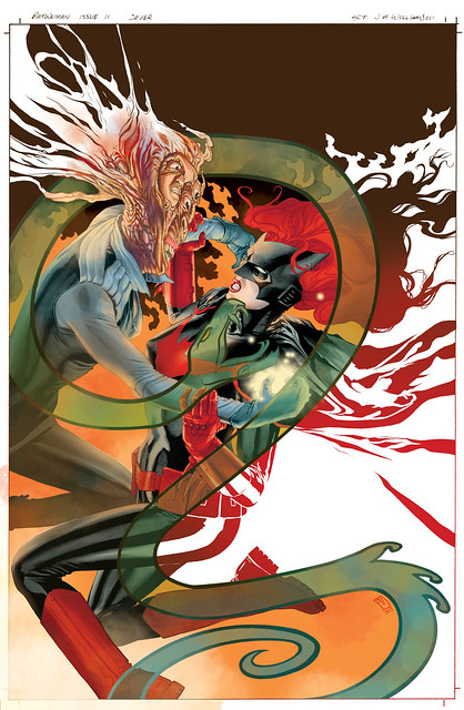
Batwoman 11 cover…
Thursday April 12th 2012, 9:22 pmJust as shown before, I’ve broken this down into the basic stages. I plan on doing the next post like this a little more comprehensively for cover 12. But for now Batwoman 11’s cover…
Rough crude sketch version, for editorial approval..

The black and white version. I ended up making alterations to the art at the next stage…

The color version. After completing the digital color work I felt the semi-transparent Medusa snake emblem no longer worked as going over the top of the villain’s warping fleshy face. So I went in with photoshop and eliminated parts and redrew parts. The end result is much more effective for the color version. What I find odd about it is that in black and white it worked as I had it just fine. This shows how adding color can change the dynamics…

Logo and credits version…

8 Comments so far
Leave a comment
Hey there Ash
Thanks, glad you like these simple cover stages posts. As for color, I’d say the key is the image design needs to work and function in both black and white, and color. So when designing the piece, make sure you’re thinking about the palettes to be used, and their placements of pigment variations. This is important to direct the eye, just as you want to direct the eye in black and white too. Its something I’ve had to learn before getting the hang of it, took awhile for my brain to think in dual visual terms at the design and drawing stage. The more you practice thinking this way the easier it comes.
I absolutely love the cover breakdowns that you do. I truly allows me to appreciate each individual element and then when I see the color – it really pops! I also find that with the breakdowns, even the smallest details are more readily captured. Love it!
Comment by Pam 04.16.12 @ 2:08 pmHey there Pam
Thanks very much. I think its always interesting seeing various stages, particularly when comparing back and white to color.
You’re art is so inspiring as usual. 🙂 last week I’ve sent Batwoman Elegy to my parents who live at Korea. Although they couldn’t read Greg’s wonderful writing because of language barrier, they’ve got to see your art and they loves it. Print comics are basically dead in Korea and It’s majorly due to illegal scans but I think the real reason is that people haven’t seen what comics can truly do. It’s my dream to bring print comic back to Korea.
Comment by Peter 04.23.12 @ 4:59 amYour art has gotten me into western comics and through this I’ve discovered many other talented artists like Capullo and Pasqutte. I’d like to keep this momentum and create my own unique piece of work that’ll hopely inspire others. Thank you for unleashing your golden imaginations to comics instead of anywhere else! My life wouldn’t be the same without your art! 😀
Comment by Peter 04.23.12 @ 5:09 amHey there Peter
Thanks for sharing that with me. That is so cool that your parents in Korea liked what they saw, that is inspiring.
Hello again Peter
Thank you for such sweet words about my work. And I love hearing that you are discovering many other talented artists working in comics. There is a lot to discover my friend.
Leave a Comment
** Required but not displayed
This is awesome, J3! I’m beyond thrilled that you’re posting your process on here. It’s tremendously helpful to have this window into the professional art world. I can relate to your issues with color changing dynamics. I’ve found that color can sometimes dilute the line weights and/or sap the lighting for it’s cinematic quality. Add these problems in with coloring a character with perpetually fire-truck-red hair… and I can only imagine the frustration. Do you have any tips for striking a balance when coloring your covers or pages? What would you say is the primary job of color? And how can you keep it from trumping other aspects of the work?
Comment by Ash 04.12.12 @ 9:39 pm